A while back I wrote about why we use Joomla instead of WordPress or Drupal. This question hasn’t left my mind. In fact, its grown very big. I started to question my own idea that Joomla/K2 is better. I noticed features that we didn’t have compared to WordPress, and I also started using and learning Drupal (which by the way is pretty sweet).
A while back I wrote about why we use Joomla instead of WordPress or Drupal. This question hasn’t left my mind. In fact, its grown very big. I started to question my own idea that Joomla/K2 is better. I noticed features that we didn’t have compared to WordPress, and I also started using and learning Drupal (which by the way is pretty sweet).
The issue is that most of my clients have heard of this awesomeness called WordPress. WordPress is extremely well branded, has a community the size of a medium sized country, and extensions so varied that picking one is difficult. Why is it so successful? I think it can be attributed to its free hosted version as well as the above mentioned “Branding”. In this two part post by me and my trusty sidekick Max, we compare how Joomla as a whole could learn a lot from both WordPress and Drupal.
Target Audience and Marketing
As Ryuhei mentioned, one of the main reasons Joomla has been overshadowed by WordPress is its branding. However the root of the problem is not the branding itself, but yet marketing to the right target audience.

WordPress is marketed towards the end user, the general public. Joomla on the other hand is marketed towards the developer who cares less about the product’s overall look, but likes it for its use of MVC structure (like my friend Ryuhei).
I don’t mind this, because Joomla is an open source, non-corporate backed CMS, so marketing is probably not at the forefront of its concerns. However, a product should be engineered and branded towards the right demographic. That’s a fact of business. Joomla marketing towards developers is like Toyota marketing their new line of cars towards car mechanics. It doesn’t make sense. In the end, it’s the general public who will be making the final call on what CMS to use. The developer is only doing the mechanical work to get the engine running.
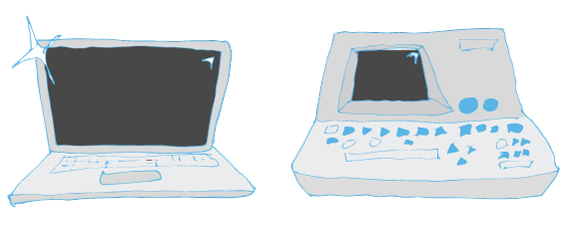
Joomla should take a note from WordPress and understand that their target audience should be the general public. These are small business owners, artists, bloggers, corporate suits, business managers, nonprofits etc. Frankly a lot of these people don’t care about Joomla’s inner workings. They care about the overall look and feel of the product. For example, the majority of people don’t know much about Mac’s operating system or hardware. However, Apple has a huge following due to their successful marketing and their use of materials (aluminum and glass as opposed to those plastic Windows computers).
Branding
Now that we’ve discussed the target audience it’s time for the B word. Good branding is crucial in order to successfully market a product. You can advertise all you want, but if your audience doesn’t feel a certain connection, no one will use your product. Below are some ways in which Joomla’s branding can be improved upon.
Color
Joomla’s website and UI uses a lot of navy blue, which conveys expertise. Though this is not a bad thing, we have to remember that Joomla isn’t a service but a product. Therefore, the colors should not convey the creators’ expertise, but yet relate to the users in some way.
The current navy blue is too serious and mature. This is good if you are a bank dealing with money. However, technology is expected to be up to date, young, and fresh. For example, Drupal uses a lighter blue that conveys a sense of youth and energy, which is actually revered in the tech world.
Also, Joomla’s navy blue does not encompass its whole audience. Aside from maturity, it also conveys a sense of masculinity. In fact, I notice that we have a harder time convincing young and/or female clients to use Joomla. Whereas older male clients with corporate jobs tend to have no problem using Joomla.
 WordPress is successful at toning down their branding in order to attract people from many different backgrounds. Their brand features greys, white, black, and a neutral blue. In this way, the brand seems to relate with people of all genders and professions.
Joomla’s green, red, blue, and yellow combo does remind me a lot of Windows. It can also look a bit childish when placed on a blue background (Fisher Price?). However, I do like how it conveys a sense of unity characteristic of the open source community, and so I don’t mind the color combo. In fact, it looks pretty good when placed on white, black, or grey.

Logo
The name Joomla refers to the Swahili word, “jumla”, meaning “all together”, a reference to its open source philosophy. Though the name and colors are fitting, Joomla’s logo is not. Its squareness and symmetry is too structural and corporate.

In fact, between the three main CMSs, Joomla looks like the big corporate enterprise that offers a lower quality product, when this not the case. Joomla’s logo should reflect their open source philosophy and non-corporate backing. This can be achieved by redesigning the logo to include more organic shapes and/or hand-drawn elements.
The squat typography used in the logo is too stylized. It targets the male techie audience and again ignores the broader target audience. Fonts that are less stylized, more proportionate in height and width, and well rounded are good fonts to use when targeting broader audiences.
WordPress makes use of serif fonts, and this works for them because they’re mainly a blogging system. It gives them a literary look. I’m not suggesting that Joomla make use of serif fonts. In fact that would be a mistake, because it doesn’t fit their product. However, yet again, Joomla can take a note from WordPress. WordPress’ use of typography gives them character without being too stylized to the point that certain demographics are turned off from using the product.

Even small changes such as slightly rotating the logo, make a huge difference (see below). The slightly tilted logo has more movement and is more playful. And when combined with neutral typography, it looks like a whole new brand.

Website
Once issues regarding the color and logo are fixed, the joomla.org website will look substantially better. However, there are certain features on joomla.org that can be reworked in order to better represent the product.
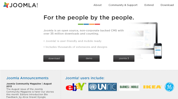
Currently, the content that’s above the fold bombards the user with Joomla’s accomplishments. The featured video goes on about statistics on Joomla’s large user base and accolades. There is no information on what makes Joomla great or the features it includes. We know that video is supposed to be good for reducing bounce rates, but the video here isn’t helping anybody. Overall, the website looks desperate.
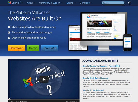
The language used in both wordpress.org and drupal.org tend to describe the products and community behind the products. Slight differences in language make big differences in how people view a product. It’s like the difference between talking cars with a car salesman and an engineer who built the car. One desperately lists accolades and prices while the other describes the car’s features with sincerity. One is annoying while the other is respected (sorry to any car salesmen).
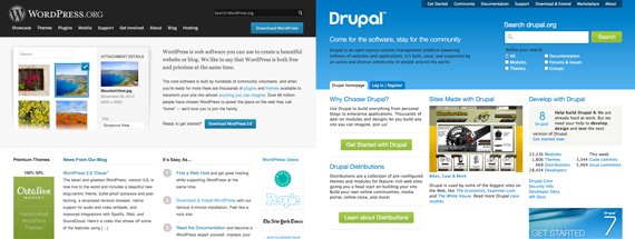
One feature that is worthy to show off is the “Look Who’s Using Joomla” section. In fact, this should be moved above the fold. wordpress.org and drupal.org both have similar sections above the fold. Regardless of the competition, there are some impressive brand names that use Joomla’s platform. People should be able to see this when they land on the page. These brand names are much more impressive than awards and statistics, because they legitimize the product through association.
Below is a mock layout of joomla.org which I threw together. It’s not perfect, and some may agree that it still looks very corporate. However, it’s clean and better targeted towards the general user.
User Interface and User Experience
First of all, I’d like to say that Joomla did a great job on version 3.0. The backend UI is simple and easy to use compared to before. The styling is simplified and easier on the eye. It was also built using Bootstrap so it’s mobile responsive. It really seems that the Joomla User eXperience team is hard at work and it’s paying off!

There are a couple features that I personally don’t have a need for, but they would help many of my clients if added on the next version (and ironically WordPress has both of them).
One is a full page text editor in stock Joomla. Believe it or not, a lot of people write content directly into the content field in Joomla. Therefore, a full page text editor that excludes all other options would further simplify the UI for less tech-savvy users.
Another feature that would be helpful to the common user is a simplified image editing system. For example, our favorite component K2 has it’s own version through splashup.com. However, this includes many other features that are unnecessary and rather confusing to the common user, who do not need to add tints and gradients to images. Most users only need to resize and crop images for the web. An image editing system that solely includes basic functions such as crop, resize, rotate, and reflect would be useful for these users.
Extensions
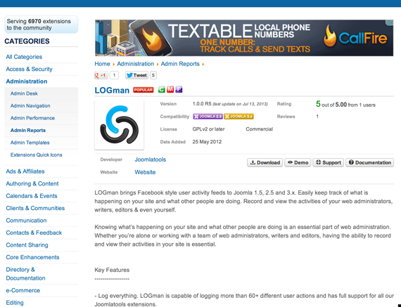
The Joomla extensions directory featured on joomla.org can use a little work as well. From a design perspective, the current interface is very cluttered. The extensive and rather hard to read categories sidebar distracts from the rest of the page. Also the main content space is relatively wide (730px), making it hard to read text.
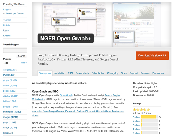
WordPress’ plugin directory has a similar general layout as that of Joomla’s. However, by featuring only popular tags on the sidebar, better spacing between content, different font sizes and color, and narrower main content width, the site is easier to use; information is easier to find and content is easier to read.
Joomla’s extensions directory also relies too greatly on the plugin developer’s external site. Any documentation, support, screenshots, or installation information is dependent on these external sites. These sites often aren’t well maintained, so content is hard to find or unavailable.
WordPress’ plugin directory has all of the basic information on site. Aside from descriptions, there are sections for installation instructions, screenshots, changelog, stats (showing the downloads/day), support, and information for developers. By featuring all of this content on site, WordPress has established itself as the easy-to-use CMS. Users don’t have to sift through other sites in order to get information, while developers can easily upload content about their plugin through the plugin directory. All in all, WP’s useful plugin directory helps to create a well supported, community based CMS.
That said, we know that Joomla is working on an “app store” (to be named still!). Hopefully that’ll solve the above issue all together.
Documentation
As with many open source software, Joomla’s perhaps greatest Achilles heel is lack of easily readable and accessible documentation. I judge documentation quality as compared to Codeigniter which has GREAT documentation.
Sure, a MediaWiki based documentation exists, but again the branding/templating aspect is lacking. Codex.WordPress.org uses the same MediaWiki system, but the styling and the branding makes it a lot easier to not only read, but understand.
The worst part of this is that the MediaWiki docs for Joomla is completely lacking in content structure. This makes it practically impossible for any true beginner to get started. Sure, a good UI/UX makes it so that documentation isn’t required, but most of our clients definitely need a lot of hand holding.
Comparing Joomla’s “How to write a component”
http://docs.joomla.org/Developing_a_Model-View-Controller_%28MVC%29_Component_for_Joomla!2.5
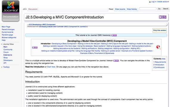
and WordPress’ “How to write a plugin”
http://codex.wordpress.org/Writing_a_Plugin
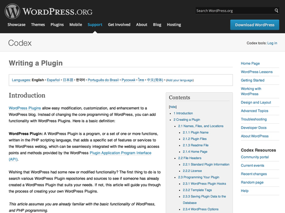
It’s instantly clear which project has an upper hand.
This is also the case for the simplest of the documentation however. Take a look at this: http://docs.joomla.org/J3.1:Getting_Started_with_Joomla!
The page lacks content on the “Categories” and “Articles” sections. I know it didn’t take me long to figure out how to use the Articles system, but most end users definitely need a lot more help.
This issue is obviously attributed to the number of people who are involved, but without documentation software is useless to an end-user.
Conclusion
Don’t get us wrong, Joomla is a great platform. In fact, the structure of the CMS is great, which is why we choose to use it on the majority of our sites. While much of Joomla’s hard work has been done it is frustrating to see it not bloom. It only lacks the little things needed in order to attract the general user. Appropriate branding, certain UI features for the novice, a well managed extensions directory, and easy to follow documentation all need to be developed for Joomla to become the CMS of choice.
About Us
We’re just 2 young guys making websites and webapps for small businesses. We’re based out of Seattle, WA. We use Joomla and WordPress on a daily basis and know of its pros and cons. We know that people are working hard on Joomla, we know that it has its share of issues, and we know Joomla Framework is close to PSR-0 (maybe even 1 and 2). We’re small, young and new; we’re not fat, old and slow. We know Joomla can use some of that young and new to attract younger audience and this is our 2 cents.
