

There are many factors to consider when designing for foreign clients and unless you’ve lived there for most of your life, it takes a good amount of research in order to understand the culture and to design well for the culture. Many designers can probably relate to this. The design process comes naturally when you are designing for brands where the target audience is similar to you. Whereas, if a brand’s target audience greatly differs from you, designing can be pretty tough. So below I regurgitates some things I’ve picked up from working with foreign clients.
The world is only getting smaller. These days, it’s more common to find yourself doing work for foreign clients. At Y-Designs, we have a few Japanese clients. Initially, I thought that the fact that I’m half Japanese and lived in Japan as a youngster meant that I understood Japanese culture and design. However, as I started to work with Japanese clients, I realized that this is not entirely true.
There are many factors to consider when designing for foreign clients and unless you’ve lived there for most of your life, it takes a good amount of research in order to understand the culture and to design well for the culture. Many designers can probably relate to this. The design process comes naturally when you are designing for brands where the target audience is similar to you. Whereas, if a brand’s target audience greatly differs from you, designing can be pretty tough. So below I regurgitates some things I’ve picked up from working with foreign clients.
Design elements to keep in mind
Typography
Different languages have different standards in writing; what looks good to you may not look good to them. Often times, font types may suggest something completely different for different cultures.
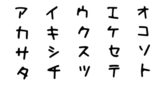
For example, the font below is a Japanese font that I initially thought of as a child-like and playful font. However, turns out it’s the standard font used for small bars in Japan. Glad I did my research!
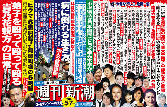
What is considered easily readable also differs between languages. Some languages prefer greater line spacing and letter spacing while others like to compact text. Take a look at the Japanese tabloid displayed below. To any foreigner it seems way too crammed and illegible, but it’s standard reading material for Japanese people. I recommend that you research a variety of print material from your client’s country and take note of the typography.
Text orientation may differ as well. Asian and Arabic countries orient type differently (vertical and right to left). Some use different orientation in different contexts. Make sure you get a good grasp of what text orientation is appropriate in different circumstances.
Layout and Structure
Working with Japanese clients has forced me to understand the importance of layout and structure between languages. Sometimes what may look cluttered to you looks well organized to others. Japanese websites and magazines are often times very grid-like. Along with minimal line spacing which I mentioned above, Japanese layouts are often crammed together and looks chaotic to a gaijin (foreigner). However, this looks well organized and easy to read to Japanese people.
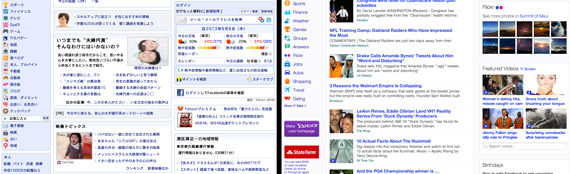
Take a look at the Japanese and American Yahoo pages displayed below. The American layout has a lot more whitespace between content, while the Japanese layout is much more crowded.
Colors
Much like typography, colors convey different moods between cultures. For example, in the US the color green often evokes a feeling of wealth, probably due to the color of the American Dollar. However, in other countries, the currency is often times not green and so the color evokes different feelings. In the Muslim religion, green is considered a sacred color.
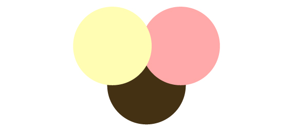
While working with a Japanese client, I was encouraged to use light yellow, light pink, brown and white for my color palette. The design was targeted towards a female demographic in their upper twenties to middle age. To me, the color palette seemed to suit babies and young children better. However, I found that many of their competitors used a similar color palette.
Color selection can also be regional. Whether it’s conscious or not, Often times one’s surroundings affects their color selection. You can even see this between different regions in the US. Displayed below are the logos for the Seattle Seahawks and the Miami Dolphins. Notice how the different blues very much represent their respective regions. Keep this in mind when designing for foreign clients, especially if they have a local audience.

Audience
When designing for foreign clients, it’s easy to categorize their audience as one national group. However, just as there are people of many sub cultures, races, and ages here in the US, the same goes for other countries. Have your clients give you a thorough description of their target audience. And please… don’t make assumptions based on TV shows or movies. Prior to visiting the US, my Spanish friend imagined Seattle to be like the cult TV show, “Twin Peaks”.
Also, understand that a certain demographic in one country may not have the same interests and taste as those of the same demographic in another country. A 65 year old man from Istanbul will probably have different taste from a 65 year old man from LA.
Subject Matter
No one wants to know that an American designed a Chinese poster or brand. Make sure that your subject matter represents that country. Any figures within photos or illustrations should depict the local people.
For example, when I designed a web banner for a Japanese company, I initially used an image that featured a caucasian man and an Asian woman. One thing the client noted in their set of revisions was that they would like me to use an image of a Japanese couple. In the US, we tend to prefer diversity in our ads, because it engages a wider audience. However, in other countries that are less racially diverse, this may actually diminish the effect of the ad, because less people are able to connect with it.
Research material and sources for brainstorming
- Go to a bookstore that has books or magazines from that region. This is a great way to research your target audience.
- Take note of design elements such as typography and layout. And though you may not be able to read the written content, take note of images in order to get a glimpse into their culture and lifestyle.
- Order design books, design field guides and typography files from that country.
- These will be your instruction manuals. We purchased a book that contains Japanese fonts and examples of their use. This has been a huge help in sharpening my Japanese design.
- Look at competitors. You don’t want to make your client look like their competitors, but it is important to understand the market.
Doing business with foreign clients
- Business standards and expectations are different in each country. It’s easy to get frustrated in this way.
- It’s Important to be polite. No one will get angry about over-politeness.
- It’s best to initially explain your general process of work so clients get an introduction before you start. This way they know what to expect.
- You may offer a fresh perspective as an outsider and ideas may be easier to come by. Don’t be scared to communicate some of these thoughts that may be outside the box of what your clients are used to. They hired you for a reason. It may be what they’re looking for.
- Be aware of time differences. Be considerate when scheduling phone conversations and emailing with your clients. It may be their weekend, a holiday or 1AM in the morning. Also keep this in mind when scheduling deadlines. You don’t want to scheduled a deadline on your Sunday afternoon.
Conclusion
Hopefully this article helps you in your international projects. Overall, designing for foreign clients has helped me grow and learn as a designer and business person. I’m still looking for that project where I get flown out to a foreign country. So if anyone wants to fly me out for a business meeting… shoot me an email.


