

I’ve noticed that many times people try and incorporate too much into a logo; cramming three different icons into one. However, doing so ignores the true purpose of a logo. Logos should be kept clean and simple in order to be recognizable, timeless, and versatile.
I’ve noticed that many times people try and incorporate too much into a logo; cramming three different icons into one. However, doing so ignores the true purpose of a logo. Logos should be kept clean and simple in order to be recognizable, timeless, and versatile.
Good logos are recognizable.
You want your logo to stand by itself. McDonalds, Apple, and Nike all have recognizable logos and they achieve this by creating simple yet distinct shapes. These shapes are easy to remember and make an impression when you see them. A complex logo is difficult to remember and therefore difficult to recognize when you see it again.
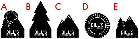
For example, look at the logos below. logo A combines three different icons while logos B, C, and D feature only one distinct image. Logos B, C, and D have distinct shapes that stand on their own. Therefore, these logos have a better chance of being recognized because they’re more easily remembered. Logo E combines two icons which is still more recognizable than logo A (it also resembles a logo belonging to a certain outdoors company based in Seattle).
Good logos are timeless.
Whether it be changes in their scope of work, marketing, or product design, businesses evolve as they mature. This often happens in order to follow trends and adjust to the times. Though some logos may be tweaked slightly as the brand progresses, these changes should be kept minimal. Making drastic changes to a logo is like changing your name from Bill to Sue, it’s confusing to anyone who knew you as Bill.
Clean and simple logos are the easiest to make minor tweaks to while maintaining a recognizable brand.
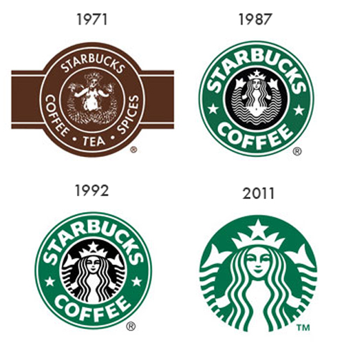
The image below shows the evolution of the Starbucks logo. The 1971 logo is quite different from the rest, because in 1987 Starbucks was sold to Howard Schultz who rebranded Starbucks with the goal of expanding the small cafe. However, from 1987 to present the Starbucks logo has remained relatively consistent. The simple circular shape, sans-serif font, and mermaid character has allowed Starbucks to keep the same assets within their logo. They were able to progress with the times while maintaining a recognizable brand through slight changes including resizing their mermaid character and removing text. Also note that the Starbucks logo is getting simpler as it progresses!
Another reason why clean logos are timeless is that unnecessary “decorations” in a logo often become outdated.
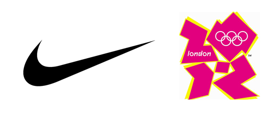
Below is an example of a timeless logo (Nike logo) and a not-so-timeless logo (London Olympics logo). As you notice the Nike logo is clean, simple and sleek. Created in 1971, it still looks contemporary and will probably look that way for another 50 years. On the other hand, the London Olympics logo features indistinguishable shapes and crazy colors and outlines that screams the eighties and nineties. Though this logo has less need to be timeless, because it was made for a one-time event, it is a great example of how a logo can personify a certain era and be anything but timeless.
Good logos are versatile.
When designing a logo, it’s easy to get fixated on the logo itself, that you forget about its application. Logos are placed on different products, mediums, textures, and colors. Logos will be featured in many different sizes. Often times a sponsor or partner will use your logo and you will not have the ability to choose how or where your logo is placed. Therefore, your logo should be simple so that it looks appropriate in many different settings. It must be legible at small sizes and able to be printed in monochrome. By keeping your logo simple and clean, it allows your products and website to have more complexities without your logo getting in the way.

Though logos are meant to encompass your brand’s image and values, it’s best to keep it simple and clean. There should be as much emphasis placed on the functionality and practicality of your logo as there is placed on symbolism and aesthetics. Keep it simple!
Note: All registered and trademarked logos belong to their respective owners. We just wanted to use your stuff as good examples!
Let us know if you’d like these simple yet effective principles applied to your logo. We’re happy to help! Contact us about logo design.
