

Graphic designers, industrial designers, fashion designers, web designers, and architects all follow similar design concepts when designing their respective products. The design concepts are simple and straightforward, but it’s applying these concepts effectively that’s difficult. Below I list a few easy design concepts you can follow to help you with your next design project.
Graphic designers, industrial designers, fashion designers, web designers, and architects all use similar design concepts when designing their respective products. The design concepts are simple and straightforward, but it’s applying these concepts effectively that’s difficult. Below I list a few easy design concepts you can follow to help you with your next design project.
1. Golden Ratio / Rule of Thirds
The Golden ratio is a pattern that is often seen in nature. Flowers, shells, hurricanes, and human faces are just some examples of the Golden Ratio in nature.
So what exactly is the Golden Ratio? It’s when you divide a line by approximately 1.62 its length. This creates a ratio so that (a+b)/a = a/b = the Golden Ratio (displayed below). Pretty cool huh?

So how is this a design concept? Well this ratio is considered to be aesthetically pleasing. Many artists and architects use this ratio in their work when creating forms and compositions.
The Rule of Thirds is a variation of the Golden Ratio. It’s where you divide your canvas/workspace into thirds, both vertically and horizontally (displayed below). These divisions should act as guides for composition. Objects can be placed to follow the guidelines, focal points can be placed at intersections, or composition can change between sections.
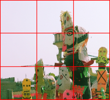
Both the Golden Ratio and Rule of Thirds can be used in illustration, logo design, print design, and studio art in order to create interesting and aesthetically pleasing compositions.
2. Be Deliberate
Designs usually follow certain rules of alignment, pattern, and symmetry. However, in order to make designs interesting and unique you may break away from a certain rule from time to time. I highly recommend doing this to freshen things up. However, when doing so, make sure that the difference is noticeable enough that it seems deliberate and not a mistake.
Below is an example of what I’m talking about. One graphic is not deliberate (a) and one is deliberate (b). Though this example might seem exaggerated, notice how the gap in figure a is so small that it seems like a mistake while the gap in figure b seems purposeful.

3. Contrast / Similarity
Knowing when to use contrast and similarity within designs is very important.
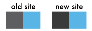
Contrasting elements bring a sense of sharpness and dominance within a design. This is very useful when creating bold graphics or clear divisions within a website or brochure. When redesigning our new website, we darkened our gray a bit in order to sharpen our look (see below).
Similar elements bring a sense of harmony within a design. Repeating shapes and patterns create compositions without a dominant focal point. Using similar values allows for subtle changes that are useful for backgrounds and shadows so they do not draw too much attention.
4. Simplicity
I’ve already written a blog entry that stresses simple logo design, Clean Logo Design: Why simplicity matters. However, aside from just logos, I recommend keeping most designs simple. Now I’m not saying that everyone should become a minimalist. There are many amazing designs that have intricate details. What I mean is that designs should have an element of simplicity. Simplicity can come in the form of negative space and composition, forms and shapes, or patterns and gradients.
Often times people are attracted to familiar shapes or relief within a design, so don’t make your design too convoluted.
5. Form and Direction
Different forms and directions evoke different emotions. Rounded corners are often “gentler” and more “playful” while sharp corners are often “harsher” and more “serious”. Vertical lines are orderly and alert while horizontal lines are balanced and still.
Deliberately apply forms and directions to your design. If you’re designing for a certain brand, consider the product, target audience, and purpose of the brand before you jump into designing.
Conclusion: Use these design concepts with purpose
The simple design concepts I list above are some things to get you thinking for your next design project. Every concept has its purpose and they may not all apply to every project. How you use them is up to you. Design with a purpose and have fun! As a great additional resource Why “Simple” Websites Are Scientifically Better does a good job of explaining a little more in depth why some elements of simplicity are effective.
Let us know if you’d like help in creating a new website!


