Create an Album Cover: Blue Note Jazz Design
I’ve recently become a big fan of jazz music and the art behind the culture. Specifically the cover art featured on the records produced by Blue Note Records. They combine minimalist shapes and composition with photography and bold typography. In this tutorial I’ll show you how to create an album cover characteristic of Blue Note Records.
Step 1: Jazz Design Elements: Planning and Sketching
In order to create an album cover, we must do research on the musician. Album covers are a form of branding for musicians, and so all branding principles apply. In our case we are going to do a bit of research on the record label.
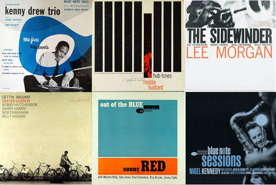
There are certain design elements that are characteristic of Blue Note Records and jazz design in general.
- Use of geometric shapes
- Non symmetric composition
- The Rule of Thirds (If you don’t know the Rule of Thirds, check out my blog entry about design concepts.)
- Objects running off edges
- Monochrome photographs
- Bold and condensed sans-serif typography
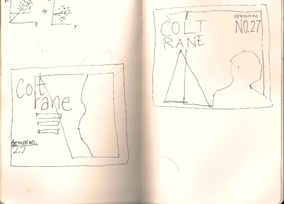
Keep these design elements in mind when outlining your cover art. Below is a scan of my sketches. I know they seem rather rudimentary, but it’s easier to do the initial brainstorming on paper. You can always alter your design later. I’ll be using the design featured on the left side.
Step 2: Create an Album Cover: Initial Layout
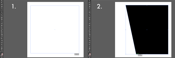
First step is to create the basic layout. I start by drawing the background shape. I do this by creating a rectangle and then using the “Direct Selection Tool” in order to move the bottom-left edge towards the right.
Step 3: Add an Image
Next I’m going to fill this shape with an image of John Coltrane (one of my favorite musicians). I found this image of John smoking a cigar and looking like a boss.
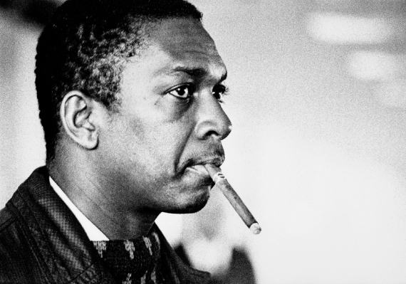
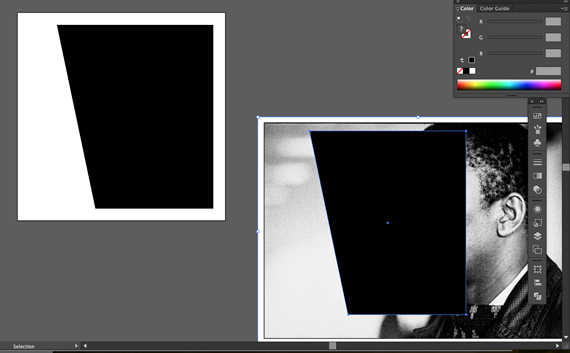
Place the image in Illustrator. I reflected the image vertically in order to better fit my design. Now I’ll create a Clipping Mask from the shape I made earlier. I like to always copy and paste the shape, just in case I need to use it later in the project.
Place the shape over the image. Make sure that the shape is above the image and not under. You can select the shape and use the shortcut (Shift + command + } ) in order to bring it to the top layer.
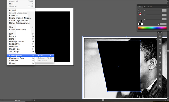
Now with both the shape and image selected, select “Object” => “Clipping Mask” => “Make”. The image should now show within the shape. Place this image on your artboard.
Step 4: Typography
Now as I mentioned earlier, Jazz designs usually feature bold and condensed sans-serif typography. I decided to go with League Gothic. If there’s another font you like better, go for it!
I want to break up John’s last name in two separate lines with the “l” running into the “r”. I typed them out in two different text boxes and lined them up to my liking. I then changed the color to a red (#e4442d) so that it would pop.
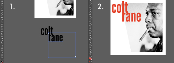
I placed the name so that it breaks out of the box created by John’s picture. Aside from aesthetics, I think this also characterizes jazz music’s free and interpretive nature.
Now I’m going to add some of John’s bandmates. These are the guys who played on his album “Blue Train”, Lee Morgan, Paul Chambers, and Curtis Fuller. Once again I used “League Gothic”, but made these names uppercase to differentiate them from Coltrane.
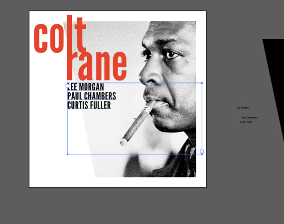
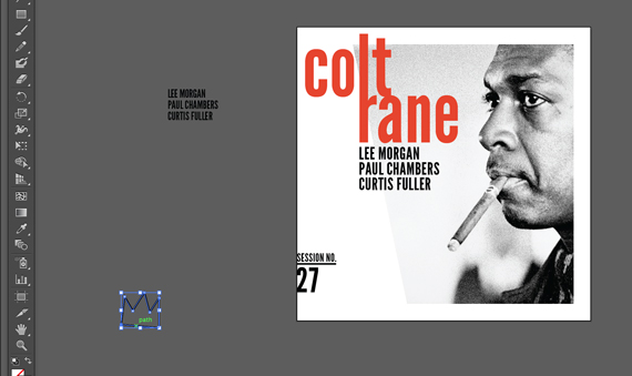
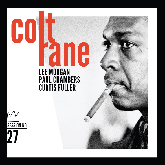
Now so far I think it’s looking pretty good. However, I do like how Blue Note Records’ album covers often have type running off of the edges. And though I’m always a fan of negative space, I think the bottom left seems a bit empty. I’m going to add a little graphic I made using type and lines in the bottom left. This creates a little more balance and the crown I’ve created adds an edginess that is characteristic to jazz music.
Conclusion
And now you have your final version. What I love about Blue Note Records’ style is that it’s simple yet bold and sophisticated. Now try to create an album cover of your own. Use different shapes, colors, compositions, and incorporate your favorite jazz artists.
If you’re having trouble following these steps, a Illustrator Fundamentals Course might help you. If you’re just interested in having an album cover made, you can also contact us.

